TREND ALERT: BLUE IS GETTING BRIGHTER AND HAPPIER

Photo by Maria Killam
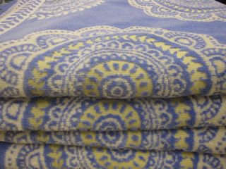
At one of the CMG Conferences a speaker once said 'If you want to know which direction colour is going, check out the towel department.'
So a couple weeks ago I snapped this photo of a stack of bright blue and yellow towels when I was out sourcing accessories for a client.
Towels don't collect dust sitting on shelves like other products do so it makes sense that there's more turnover in product, therefore new colours can appear faster. (That's my take, if you have a more accurate one, please post a comment below).

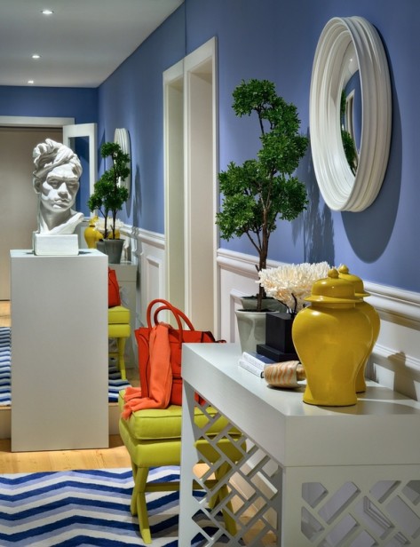
Isn't this blue entry breathtaking? The styling certainly helps but this photo is a great example of happy blues taking over from gray blues.
For years the only place I've ever chosen a blue like this was for a kids room. When I saw those blue and yellow towels, I had this sudden urge to run home and paint my main bathroom this exact colour.
Remember the post I wrote 'What everyone should know about blue'? The bottom line was that light blues need to be sufficiently grayed so that they don't look like baby blue on the walls. But if you take that same gray blue and go darker, you end up with a mans den or teenage boys room.

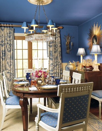
Take a brighter blue though and go darker like the above photo and you end up with happy!
What do you think? Do you see this blue making it's way into your house anytime soon?
No comments:
Post a Comment